At Spotify, I led the design strategy for Backstage’s transition from an open-source developer tool into a premium commercial offering. My role involved unifying multiple product areas, aligning cross-functional teams, and delivering an experience that matched Spotify’s renowned brand quality.
DSGN
UX

Problem
When I first joined the team, we were preparing to launch our first-ever commercial offerings - a plugin bundle for Backstage, followed by a marketplace for third-party plugins. At this point, these products were hosted on our outdated site that was badly in need of a redesign. Compounding this problem was the upcoming release of our most ambitious product yet - Spotify Portal for Backstage. The approach of this release prompted a comprehensive redesign of the site and the overall branding of our product ecosystem.
We also faced confusion between two existing websites—Backstage.io and Backstage.com. The .io site had been positioned for open-source content, while .com highlighted Spotify’s contributions to open source. My task was to redefine .com as the commercial hub, clearly distinguishing it from the open-source .io site.
The goal was clear: transform a developer-focused, open-source tool into a polished, enterprise-level product, reflecting the quality synonymous with the Spotify brand.
Future-casting
Aligning teams through collaboration
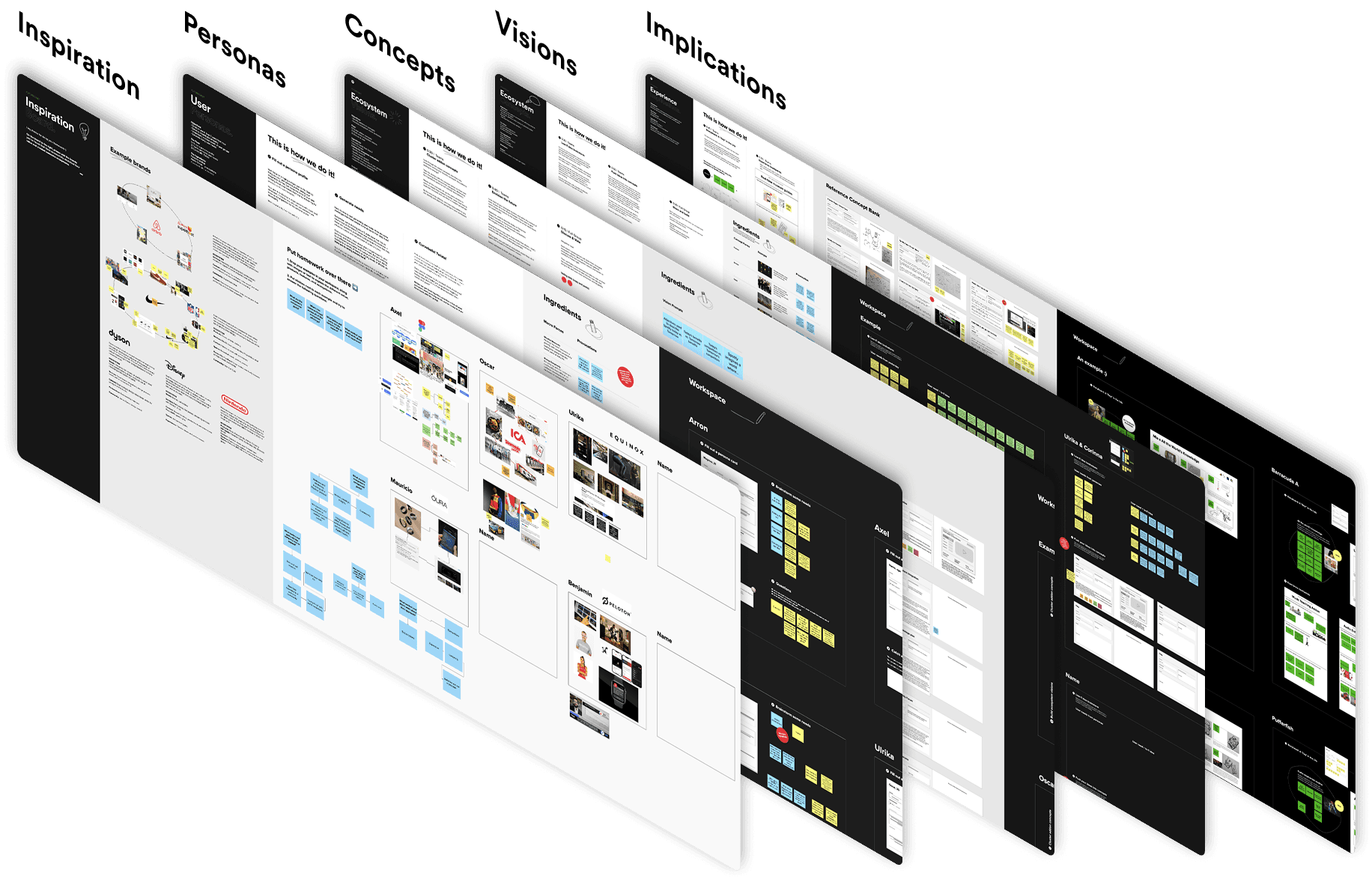
In a project of this scale, keeping clarity and alignment between all of the teams in the product area required meticulous planning and close collaboration. I began by crafting a clear and detailed information architecture, working with the product and marketing teams to refine the site structure while we aligned on a strategy. This document served as a single source of truth for the diverse teams as we planned the layout of content and built new navigation.
Alongside this, I ran sessions with stakeholders across the product area to develop a comprehensive service blueprint, identifying operational responsibilities clearly among teams and ensuring that all parts of the customer journey were effectively supported - from discovery to purchase and post sales support.

In an organisation looking to adopt Backstage there are generally three main users that you have to convince - the admin who is in charge of adopting and maintaining their organisations Backstage instance, the decision maker who is in charge of purchasing and the end user who sees the benefit of these decisions.
The new site would need to provide for the needs of all of these users and allow them to easily navigate to the relevant information for them. There are different levels of information relevant to an end user and a decision maker - for example, an end user is mostly concerned with how the features of a plugin will benefit them day to day whereas a decision maker is concerned with higher level considerations such as compatibility with their existing software ecosystem and pricing structures.
Making sense of complexity
To help unravel the complexities of our diverse user base, I created an illustrative storyboard depicting detailed customer journeys. This visual tool captured different user types, their interactions, and critical handover points within the customer journey.
Laying out these complex interactions in an easily digestible format helped the various teams to effectively identify key moments of the customer journey, aligning their efforts and decisions around a shared understanding of user experiences.

Leveraging insights to mitigate risk
To validate our design concepts, I ran user testing sessions with low-fidelity wireframes, enabling the team to rapidly iterate on the content and site structure. Engaging directly with users through testing provided critical insights into usability and functionality.
These iterative tests ensured our designs met the diverse needs of our user personas, addressing potential issues early in the process. This evidence-based approach enhanced confidence in our final designs, ensuring they were tailored to user requirements.

Using storytelling to inspire action
The content strategy of the homepage went through many iterations as we tried to balance the needs of our user types and their varying levels of knowledge of the product. Early feedback highlighted an excessive focus on product features, which lacked essential context for new users.
Working with the product and marketing teams, we broke the site down into the most important questions our users would have. Using this simplified view allowed us to balance the layout to make sure we covered every user type, no matter their knowledge of Backstage, Spotify's involvement or our product offerings.


The solution
The central narrative, "Build like Spotify," became our rallying message, instantly orienting users and communicating our value proposition. This approach ensured users at all levels could quickly and confidently identify the right product for them.
The redesigned site offered balanced product presentations, clearly differentiating between the commercial (.com) and open-source (.io) offerings. We articulated a compelling proposition to customers: "We can deliver a fully featured portal built entirely by Spotify, or we can enhance your existing portal with plugins from our marketplace," making our commercial ambitions crystal clear.
The comprehensive redesign introduced improved navigation, new landing pages, a vibrant marketplace, blog integrations, product detail pages, account management, and streamlined sign-up flows.



Results
The redesigned site effectively conveys Spotify’s brand quality and positions Backstage products for scalable growth. The redesign encompassed new navigation, multiple product pages, marketplace integration, comprehensive sign-up flows and robust customer account management, ensuring seamless scalability. The marketplace design in particular, is ready to scale to support an expanding ecosystem of users and creators.
We successfully launched a unified, user-friendly site that clearly differentiates Spotify’s commercial products from the open-source platform. The new site clearly communicates the value proposition - “Build like Spotify” - and provides intuitive paths for users at every level of experience.
Over 1,800 new adopters since launch.
Generated $594K in revenue, confirming strong market acceptance.
Elevated design standards, aligning Backstage with Spotify’s premium brand reputation.
Established a scalable marketplace structure poised for future ecosystem growth.
Resolved confusion between .com and .io, ensuring customers understand and engage effectively with Spotify’s commercial offerings.