I led design work within the Search area of Booksy's consumer app, working across a long-term redesign and shorter-term experiments. The challenge was to improve how customers discovered and evaluated providers while supporting Booksy's goal of growing marketplace revenue.
year
'26
DSGN
UX
Booksy worked well when customers already knew who they wanted to book with. For many people, the app was essentially the final step in an existing relationship: find their regular provider, choose a time and book again. But when someone needed to find a new provider, the experience broke down.
Our research showed that customers were doing much of the hard work outside of Booksy. They used Instagram and TikTok for inspiration, Google and reviews to assess quality, and external map apps to understand travel time and location. Booksy often became the place they returned to only once they had already made their decision.

Inside the app, there were few tools to help people narrow hundreds of results or understand which provider was actually right for them. Filters were limited, location didn’t always reflect how people thought about convenience, and important decision-making signals such as photos, reviews, price, specialties and availability were difficult to compare. This made finding someone new slow, frustrating and low-confidence.
That was also a business problem. Booksy wanted the consumer app to become a stronger marketplace and grow revenue from bookings with new providers, particularly Boost-enabled providers. But pushing promoted providers harder into an experience that customers already struggled to trust risked making Search worse rather than better.
So the challenge became bigger than redesigning a search screen:
How could we help customers confidently find the right provider for their needs, while creating a stronger foundation for Booksy’s marketplace growth?

Before
A barebones search experience
My focus was the Search experience within the wider consumer redesign. I worked alongside the other designers to define what the future Booksy app could become, while taking ownership of Search-specific problems such as filtering, availability, location and how providers were presented in results.
At the same time, I worked with PMs, researchers, engineers and analysts on smaller experiments in the existing product. I created and tested prototypes, helped validate opportunities from our research, and used those findings to challenge assumptions before they became part of the longer-term direction.
This gave me two connected tracks to work across: designing the future experience, while using the current product to learn what was actually worth building. The aim was to make the redesign ambitious, but still grounded in evidence rather than assumptions.

Early on, availability looked like one of the clearest opportunities. We assumed that surfacing open time slots earlier would help people find a bookable provider faster and reduce drop-off. But interviews showed that availability was only part of the decision: people still prioritised trust, quality, price and whether a provider felt right for their needs.
As we spoke to more customers, a broader pattern emerged. The real friction was not simply “when can I book?” but “how do I know who is right for me?” Users wanted better ways to narrow hundreds of results, compare providers, judge specialties and reviews, and understand whether a location was genuinely convenient.
That shifted our focus from optimising a single step in the funnel to improving the quality of discovery itself. Filtering, provider information and location became key areas to investigate because they helped customers make a confident decision before they ever reached the booking flow.

Help me narrow the field
Customers often had hundreds of options but few useful ways to remove irrelevant providers. They wanted filters for price, distance, availability, ratings and category-specific criteria such as curly-hair expertise or particular nail styles.

Help me judge whether this provider is right for me
Photos, reviews, specialties, price and other trust signals were critical to choosing a provider. Users regularly left Booksy to validate these things elsewhere.

Help me understand whether this actually fits my life
Location and availability weren't simple numbers.
People thought in terms of commuting time, traffic, neighbourhoods and their schedule rather than straight-line distance. Some users were leaving Booksy specifically to calculate travel time in external map apps.
The research surfaced a long list of possible improvements, from visual search and category pages to availability, maps and no-results recovery. Rather than treat the redesign as a feature wishlist, we used Opportunity Solution Trees and team workshops to connect the strongest research signals to specific customer problems and potential solutions.
That helped us narrow the Search work around three recurring problems: customers couldn’t narrow results effectively, location didn’t match how they thought about convenience, and provider listings didn’t give them enough information to choose confidently. These became the areas we focused on validating further through prototypes, interviews and experiments.
This gave the team a clearer way to prioritise: not by which idea looked most exciting, but by which customer problem appeared consistently in research and had a credible path to improving Search conversion.

Once we had clearer priorities, I focused the design work around three decisions that came up repeatedly in research: help people narrow the results, make availability useful without over-prioritising it, and make location reflect real-world convenience rather than simple distance. Together, these changed Search from a long list of providers into a more deliberate decision-making experience.

Help people narrow, not just scroll
Research showed that customers were manually scanning large result sets because the filters they needed either didn’t exist or were hard to use. Price, distance, ratings and specialties came up repeatedly, but people didn’t apply them all at once, they tended to establish basic viability first, then refine further as they got closer to a decision.
That led me to explore a more progressive filtering experience: start with the highest-value constraints, then reveal more specific options such as specialties or amenities when they became relevant. The goal was to reduce noise without forcing users through a rigid step-by-step flow.

Surface availability, but don’t let it dominate the decision
We initially assumed that showing available time slots earlier would make availability a stronger driver of provider choice. Research supported the first part: users liked seeing specific slots directly in results because it reduced the need to open multiple profiles. But it challenged the second - trust, quality and price often mattered more unless the need was genuinely urgent.
So availability became a comparison tool rather than the organising principle of Search. It should help users quickly understand which of their preferred options could actually work, without pushing them towards a provider purely because they had the earliest slot.

Design location around convenience, not kilometres
Location research showed that people rarely think about distance as a simple radius. Traffic, journey time, neighbourhood boundaries, parking and public transport all affected whether a provider felt genuinely “nearby”, and some users were leaving Booksy to check this in external map apps.
That led us to explore more transparent control over the search area, clearer map-based discovery and travel-time information. The aim was to give users a better sense of how convenient a provider actually was, rather than relying on straight-line distance alone.
The experiments helped us understand individual problems, but the bigger challenge was bringing those learnings together into one coherent Search experience. I used what we had learned about location, availability, filtering, provider comparison and different levels of user intent to shape a future vision centred on a location-first, map-based Search.
Instead of treating each feature separately, the concept brought them into one flexible surface where users could browse nearby providers, narrow by availability, compare key information and refine with contextual filters without constantly moving between screens. Different journeys could start from a category, a typed search or even an image, but all converged on the same goal: help people understand what is available around them and confidently choose the right provider.
Location as the foundation
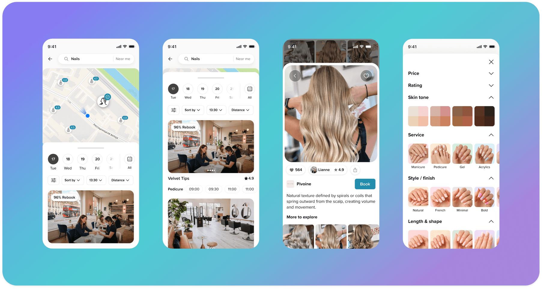
Location became the starting point for discovery rather than an afterthought. The home screen used a customer’s default or saved location so recommendations were geographically relevant from the beginning, while still allowing them to change location at any time. From there, they could jump straight into a category or use Discover for a broader, inspiration-led journey, with both routes leading into a map of relevant nearby providers.

Search that narrows as intent becomes clearer
For customers who knew what they wanted, Search supported autocomplete, previous searches and suggestions that could help refine intent around things like style or personal needs. Once submitted, the user landed on the same map-based experience, with availability, price, rating, distance and other controls immediately accessible. Provider cards sat alongside the map, making it easier to compare options without repeatedly opening and closing profiles.

Contextual filtering
The filtering system was designed to adapt to the search rather than show everyone the same controls. Core filters such as price, rating, distance and availability were always available, while more specific options could appear when relevant — for example hair type or occasion for hair, and skin tone, finish or nail shape for nails. Users could keep the journey lightweight with quick filters or open the full menu when they needed more control.

Availability without making it the whole experience
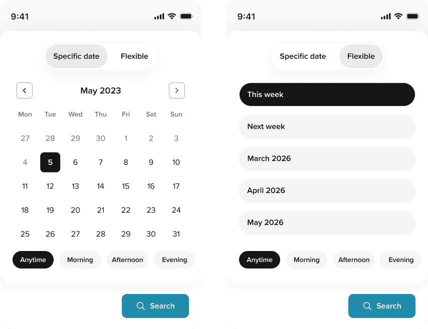
Availability was made easy to use at different levels of urgency. Users could quickly select a day directly from the map, or open the full calendar to browse further into the future and choose flexible ranges such as a week or month. This allowed the same system to support both someone who needed an appointment today and someone willing to wait for the right provider.
Visual search as another route into discovery
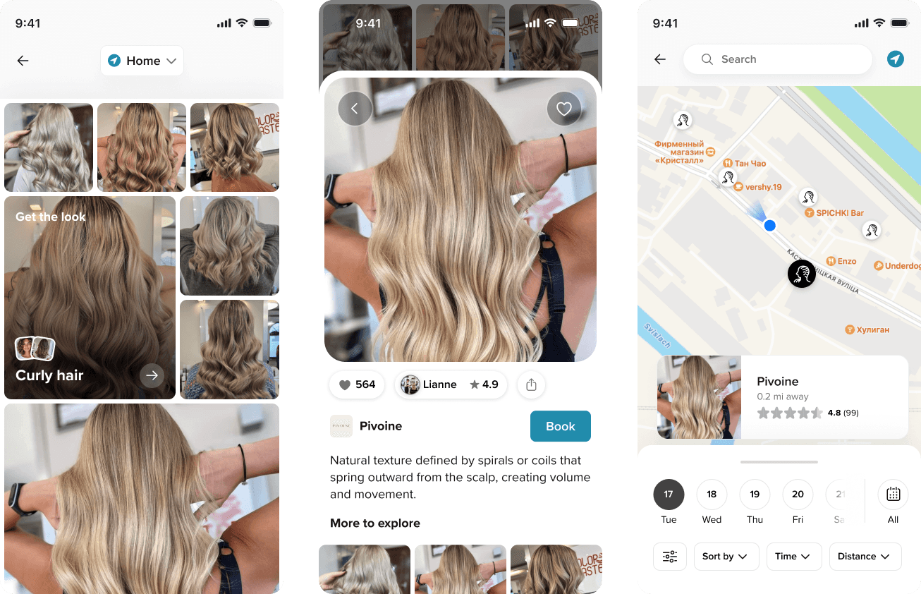
The vision also explored image-led Search for customers who knew the look they wanted but not the right terminology. Users could upload or take a photo, then browse a feed of similar work from nearby providers before switching into the same map experience. This remained a future-facing concept, but it showed how Booksy could support a more visual form of discovery without creating a completely separate journey.
One system, several ways to find the right provider
What mattered most was that these journeys all felt like parts of the same system. Whether someone started with a category, a search term or an image, they could move between the map, availability, filters and provider information without restarting. The vision brought together the problems we had uncovered separately through research and experimentation, giving us a clearer picture of how Search could evolve into a more useful discovery experience rather than simply a list of providers.

Booksy’s commercial goal was to increase Payables by driving more bookings with new Boost-enabled providers. That created a real tension: push promoted providers harder immediately, or first improve a Search experience that already struggled with relevance and trust.
We ultimately moved towards a phased approach: improve conversion and relevance first while protecting Payables, then optimise monetisation from a stronger base. The challenge wasn't choosing between customer and business needs, but sequencing them so that short-term monetisation didn't undermine the experience it depended on.


Looking back, I would have narrowed the problem space sooner. Search had an enormous number of potential opportunities, and at times we were exploring too many at once. The later strategy became much clearer once we committed to solving one customer problem at a time and tied each bet to a specific metric.
I would also have aligned success measures earlier. Even late in the project, some of the headline Search numbers still needed validating, including exactly how conversion was calculated. Agreeing on the primary metric and guardrails sooner would have made it easier to judge experiments consistently and understand whether gains were truly incremental.
Finally, I would have brought technical feasibility into the discovery process earlier. The legacy architecture made even small changes difficult, and several experiments were blocked by dependencies on the new Search service. Understanding those constraints sooner would have helped us separate ideas we could test immediately from those that needed infrastructure work first.

