At Spotify, I led the redesign of backstage.spotify.com, the commercial website for Spotify’s Backstage products. My role was to define how these products came together as a clear commercial experience - working across design, product and marketing to restructure the site, clarify the relationship between open source and paid products, and create a foundation that could grow alongside the business.
Key contributions
Led the end-to-end redesign of Backstage’s commercial website, from early strategy and information architecture through to launch.
Worked with product and marketing teams to clarify how Spotify’s commercial offering should be structured and communicated alongside open-source Backstage.
Used customer journeys, service blueprints, workshops and user testing to align multiple teams around a shared experience.
DSGN
UX

When I joined the team, Spotify was beginning to expand Backstage beyond its open-source roots. Our first commercial products - a bundle of paid plugins, followed by a marketplace - were already being introduced, while Spotify Portal for Backstage was approaching launch. But the website presenting these products had evolved incrementally and was no longer equipped to explain an increasingly complex offering.
There was also confusion between Backstage.io and Backstage.com. The open-source project lived on .io, while .com had historically focused on Spotify’s involvement in the project. As commercial products grew, the role of .com needed to change. My challenge was to redesign the commercial site into a clearer front door for Spotify’s Backstage offering — helping customers understand what Spotify sold, how the products related to one another and which option was relevant to them.
As the marketplace and product ecosystem were still evolving, I facilitated Futurecast workshops with teams across Backstage to explore what the customer experience could look like several years ahead. The aim wasn’t to define the strategy for the entire business, but to understand how the commercial experience might need to evolve as more products, plugins and partners were introduced.
These sessions helped us identify longer-term needs while separating them from what we needed to solve for the upcoming launch. That gave the redesign a direction that was ambitious enough to scale without trying to build everything immediately.
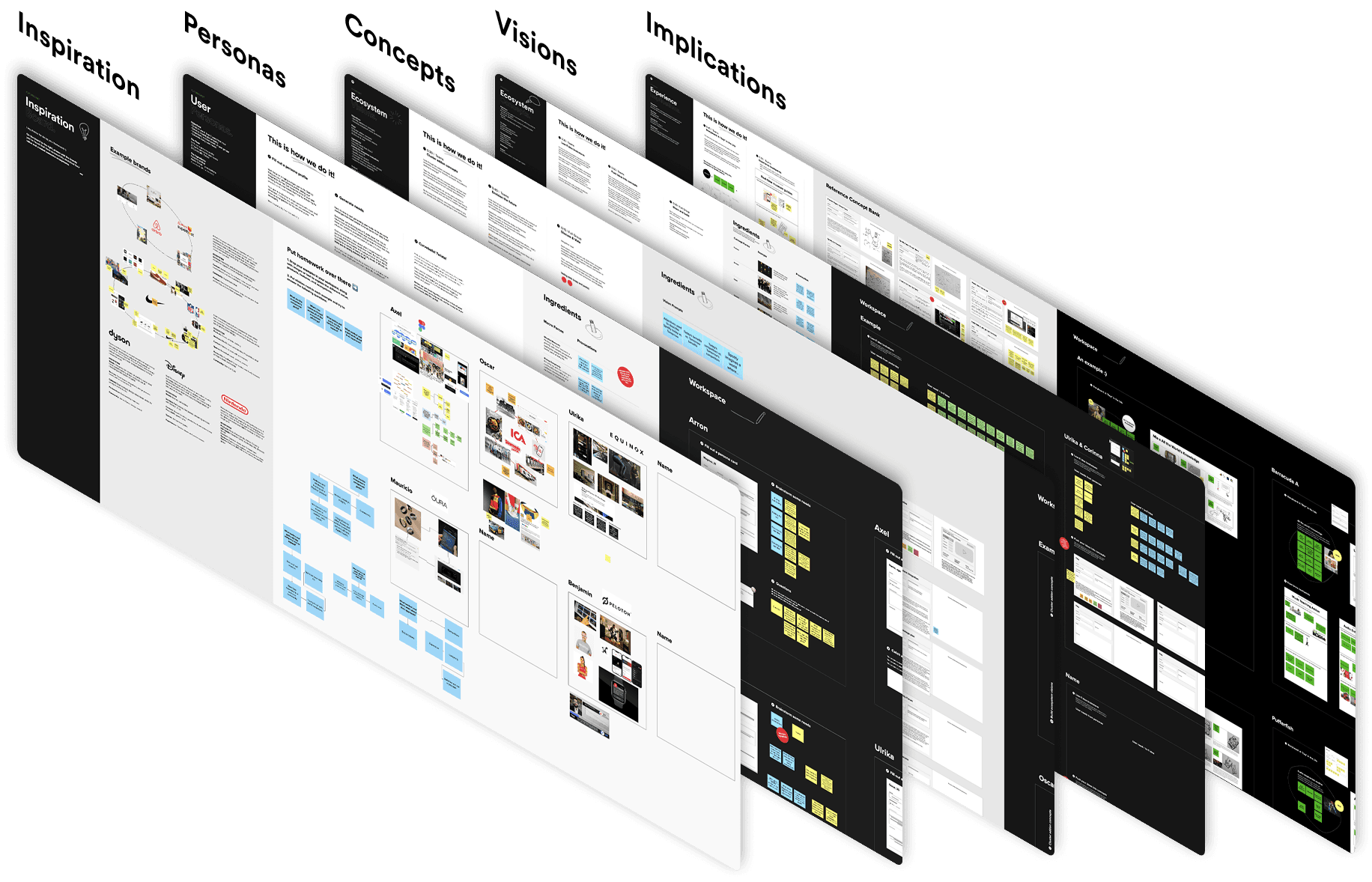
The website touched several teams - product, marketing, engineering, sales and support - so one of the first challenges was creating a shared understanding of what we were actually building. I created a new information architecture for the site and worked closely with product and marketing to refine how products, marketplace content and supporting information should fit together. This became a useful reference point as different teams developed content and features in parallel.
Alongside this, I helped map the broader customer journey through a service blueprint, covering the experience from discovering Backstage through evaluation, purchase, onboarding and support. This exposed hand-offs between teams and helped us understand where the website sat within the wider commercial journey.

Buying developer infrastructure rarely involves one person.
We identified three important audiences in the journey: the admin responsible for adopting and maintaining Backstage, the decision-maker responsible for purchasing, and the end user who would ultimately use the platform. Each needed different information.
An engineer might want to understand how a plugin improves their day-to-day workflow. An administrator needs to know how something integrates with their Backstage instance. A decision-maker may care more about security, compatibility, support and pricing. The site therefore needed to work at several levels of detail without forcing every visitor through the same story.

To make these relationships easier to discuss, I created a storyboard showing how different users could move through the Backstage ecosystem, the decisions they needed to make and where responsibilities passed between teams.
Turning a complicated enterprise buying journey into something visual made it easier for people across the organisation to critique the experience together. Rather than debating individual pages in isolation, we could ask a more useful question: what does this customer need to understand at this point in their journey?

Before moving into high-fidelity design, I tested low-fidelity concepts with users to validate the structure, navigation and content hierarchy.
This helped us identify places where our internal understanding of Backstage was leaking into the customer experience.
What felt obvious to us wasn’t necessarily obvious to someone encountering Spotify’s commercial products for the first time. Testing early allowed us to adjust the architecture and messaging before investing heavily in the final visual design.

The homepage went through several iterations as we tried to balance the needs of experienced Backstage users with people encountering the product for the first time. Early versions focused too quickly on individual features. Without enough context, customers first had to understand what Spotify was offering and why it mattered before they could evaluate specific plugins or products.
Working with product and marketing, we reframed the site around the key questions customers needed answered and built the content hierarchy around those questions. This eventually led to a much simpler central proposition: Build like Spotify. Rather than leading with a catalogue of features, the site first explained the value Spotify could offer, then allowed customers to progressively understand the products behind it.


The redesigned site repositioned Backstage.com as the commercial home for Spotify’s Backstage products, while giving the open-source project on Backstage.io a clearer and more distinct role. The experience introduced new navigation, product and solution pages, a marketplace, editorial content, account management and sign-up journeys. Together, they gave Spotify a foundation for presenting an expanding commercial portfolio without requiring customers to understand the organisational structure behind it.
At a product level, the proposition became easier to understand: customers could either adopt a more complete portal experience from Spotify or enhance an existing Backstage implementation with commercial plugins. The goal wasn’t simply to make the website look better. It was to make a growing product ecosystem easier to understand, evaluate and navigate.


The redesigned site launched as the new commercial home for Spotify’s Backstage products, giving customers a clearer way to understand the relationship between Portal, commercial plugins, the marketplace and the open-source project. It also created a more scalable foundation for future growth, bringing navigation, product storytelling, marketplace content, sign-up journeys and account management into one consistent experience.
The site supported the wider commercial growth of Backstage, contributing to stronger adoption and significant revenue growth by giving customers a clearer path to discover, evaluate and engage with Spotify’s commercial products. The project also helped establish a clearer distinction between Backstage.com and Backstage.io, while raising the quality and consistency of the customer-facing experience to better match the wider Spotify brand.


